Dan Laustsen ASC, DFF
Feb. 17, 2022

Dan Laustsen ASC, DFF shoots “Nightmare Alley” on ALEXA 65

 The Oscar-nominated cinematographer puts ARRI Rental’s exclusive 65 mm digital camera to stunning use on Guillermo del Toro’s dark and disturbing film noir. 

Feb. 17, 2022

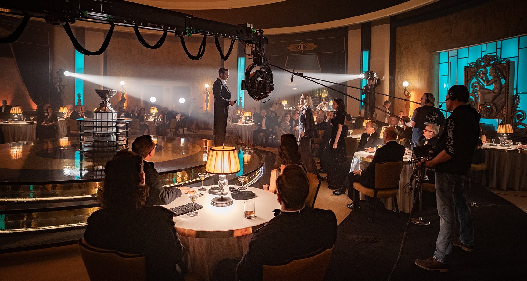
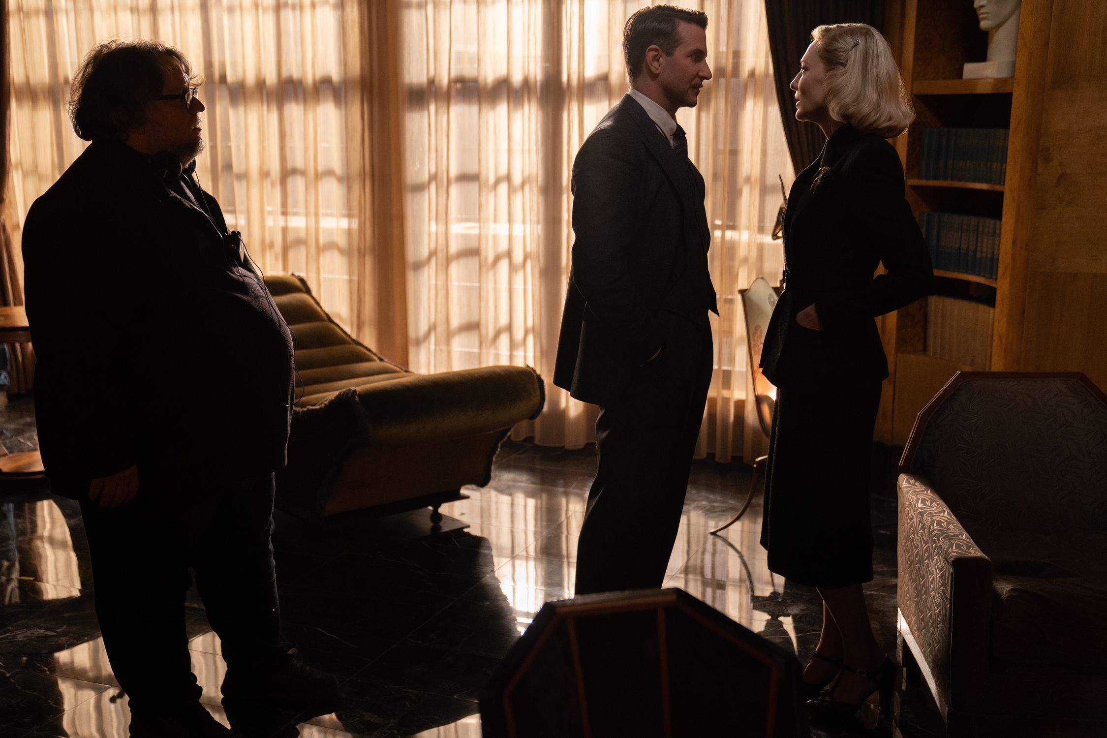
Based on a 1946 novel by William Lindsay Gresham, “Nightmare Alley” features an all-star cast and lays bare the sometimes sordid world of carnival performers in mid-twentieth century America. Director Guillermo del Toro turned again to cinematographer Dan Laustsen ASC, DFF, a long-time collaborator, who in turn tapped ARRI Rental for its exclusive ALEXA 65 camera system. The film’s main release was in color, but a black-and-white version has also been given a limited release and is building a strong following. Laustsen’s work on the movie has so far garnered him Academy, BAFTA, and ASC Award nominations.

What did you look forward to and enjoy about working with Guillermo again?

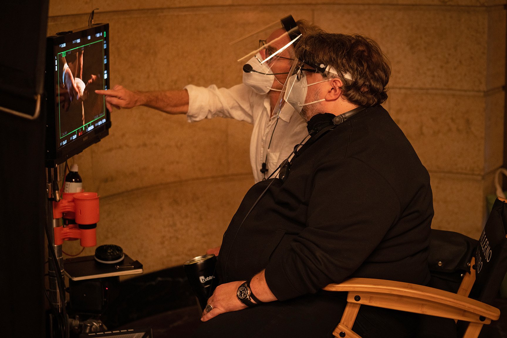
To me, Guillermo is a master filmmaker, a master of directing. I'd done three movies with him and this was number four. He's always pushing himself and pushing my work, which I really like. Every time he makes a new movie, he goes into a new world and it’s a fantastic privilege to help him with that, so I always look forward to doing more with him. He first mentioned “Nightmare Alley” when we were working on “The Shape of Water.” He talked about it as a black-and-white movie, which I was thrilled about, but eventually it became primarily a color movie, with an additional black-and-white version.

What inspired the look?

The story is based on a book and when we started talking about the project, Guillermo told me not to watch the 1940s black-and-white movie version, so that we went into it completely open. We wanted to do a movie that looks modern, but still has this classic noir look in the color. And we had to light it in a way that would still allow a black-and-white version later on.

I wanted to go large format because I knew the story would need a lot of camera movements and a lot of big close-ups on the actors. Originally, we talked about the idea of shooting in the 4:3 Academy ratio, but when we shot lens tests with large format and a 4:3 look, it didn’t feel big enough for what we wanted to do; it wasn’t the modern look we wanted, so we decided to go back to the 1.85:1 American widescreen ratio.

After your tests, which lenses did you choose?

Because the camera is moving so much, we wanted to have lenses that had a super nice performance at the close focus, and this led me to the ARRI Signature Primes. We didn’t want the image to get too sharp, though, so we did a lot of tests with diffusion filters in the magnetic filter holder at the back of the Signature lenses, inside the camera. The reason I like doing that is you keep the blacks really black, but you have this glow in the highlights and the skin tones of the actors. We jumped between one-quarter and one-eighth Black Pro-Mist filters. It was a good combination with the larger format camera.

Why did you want to work with the ALEXA 65?

It wasn’t just about the resolution; I chose the ALEXA 65 because I knew we were going to do a lot of wide-angle close-ups, and this format is fantastic for that. The way it falls off is really, really beautiful. Especially with what we were doing, putting diffusion behind the lens. I had Doug Lavender as 1st AC and we didn't have anything out of focus, which was a super difficult task.

One of the reasons I like the 65 mm format is because my background was in fashion photography, many years ago, and it pulls faces out of the frame in a similar way. You can go close to an actor's face and it makes the performance super intense, with the background falling off because of the large format. That was another thing Guillermo and I talked about when we were prepping: not just wide angles, but also going much lower with the camera than we have before. The larger format helps with that, giving you shallow depth of field when you don't want the set to be too sharp in the background.

What was your approach to lighting the carnival scenes?

When we started to prep the movie, we knew we would use a lot of steam and smoke in the carnival. The production designer and myself, and of course my lighting team and my gaffer Michael Hall, were talking about how to do this. We had this idea about how the moonlight or ambient light that backlit the smoke and steam should be steel blue. I think we had maybe eight cranes around the set with Raptors and steel blue on the lights, so that became the color palette. Then of course the practicals were a big part of the carnival lighting as well, with everything running through a dimmer board so we could control every single string of light. Michael Hall and those guys did a fantastic job pre-lighting that set, and we spent a lot of time shooting tests to be sure we were going the right way.

How different was the lighting for scenes set in the town?

When the story moves to Buffalo, the lighting gets much more Hollywood and noir. We wanted Cate Blanchett to look like a movie star, a real femme fatale, especially when she is in her office. It had to be much more precise lighting, and a little bit less warm. We took some of the warmth out of the key lights but kept the steel blue as a reference because we didn't want the color palette to switch totally.

That office set was probably the most interesting and challenging thing for me, because it was a ballet between the camera and the actors and the lighting. I had never done this kind of noir lighting before, where there is only five centimeters separating “It's going to look fantastic,” from, “It's not going to look so good.” The actors and the camera and the lighting all had to be in exactly the right spot at the same time. And these weren’t static close-ups; the scenes continued and the camera was moving so much—that’s why it was like a ballet. We were chasing the actors around with a spotlight and it worked really well because the cooperation between everybody was fantastic.


Did you use negative fill to get the shadows and contrast the way you wanted?

Yes, I did that all the time, using negative fill to kill as much ambient light as possible. For me, you really need to have a well-exposed digital negative, because you don't want to have any gray in the black. I shot the whole movie between T2.8 and T4, and at 800 EI. I'm consistent like that because it means when we are moving the camera so much, I know where my negative fill should be all the time.

Did you monitor for black-on-white on set, and did you attend two grades for the two versions?

On set we focused mostly on the color version, although we occasionally saw the black-and-white on the DIT monitors, and of course we talked about it. In the grade, the black-and-white version was all about going back to the ARRIRAW files; it was much more involved than just taking the colors out, but I couldn’t be there for that grade, Guillermo oversaw it at Company 3 in Los Angeles. For the color DI I worked remotely with Company 3 out of ARRI Media in Berlin, due to Covid 19 travel restrictions. The lighting and the diffusion we used on set, with glowing highlights and skin tones, worked well for color and also for black-and-white. It’s two different movies, but I’m very pleased with both.