House of Guinness_Stage_Teaser_Image

Creating the “House of Guinness” world

Cinematographer Nicolaj Brüel DFF sets the tone for the hit Netflix series with ALEXA Mini LF cameras, ALFA V1 and V2 anamorphic lenses, and an HDR workflow.

Oct. 23, 2025

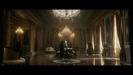
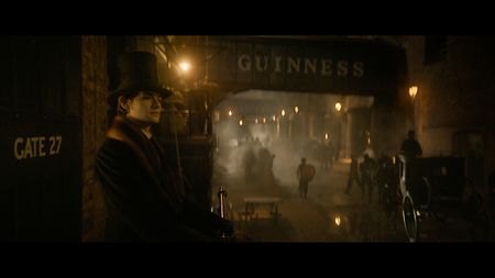
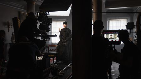
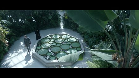
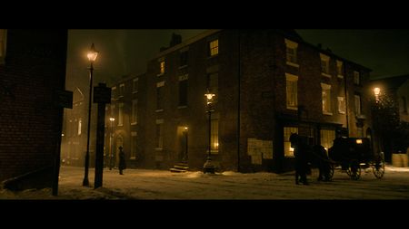
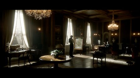
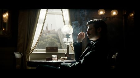
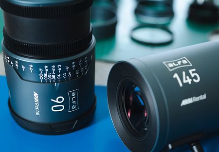
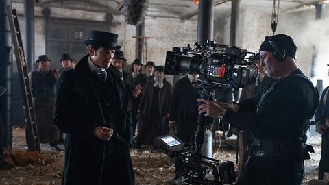
Winning over critics and audiences alike, the new Netflix series “House of Guinness” charts the relationships between four adult siblings after the death of their father, Benjamin Guinness, whose expansion of the family’s brewing company made him the richest man in Ireland. Cinematographer Nicolaj Brüel DFF shot the first five of eight episodes, collaborating with director Tom Shankland to craft a look that encompasses the highs and lows of 19th-century Dublin society. Following an HDR workflow that straddled prep, production, and post, Brüel shot in large format with ALEXA Mini LF cameras and both standard and detuned ALFA anamorphic lenses from ARRI Rental.

How did you and Tom want to visualize the world of this period drama?

Tom knew he didn’t want a classical approach to the period, in the sense of portraying the industrialism of the 1860s as a stereotypically dark and gloomy world. Steven Knight’s writing has a lovely playfulness to it, and we wanted to support that. While still keeping it somewhat realistic, Tom wanted to give the period a touch of “badass” too. That idea filtered through to the camerawork, lighting, set dressing, set builds, wardrobe—everything.

Behind the scenes of “House of Guinness”: Cinematographer Nicolaj Brüel DFF (right) and A-camera operator Karsten Jacobsen (left) discuss a shot on location using a 60 mm ALFA. Behind them is key grip Craig Atkinson.

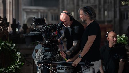
A-camera operator Karsten Jacobsen (center) and DP Nicolaj Brüel DFF frame a shot with the 60 mm ALFA. Behind them is key grip Craig Atkinson. 

Were you thinking about HDR from the very beginning?

It was part of the conversation with Netflix from the start, yes. The project I did before this one was my first experience with HDR and it was a real eye-opener for me. The difference between SDR and HDR is massive, almost as big as the difference between shooting film and digital. On the previous project I hadn’t had an HDR monitor on set, so the lighting was judged only on an SDR monitor and the final grade came as a bit of shock. So, I gained a lot of knowledge and I was very keen to be in complete control this time around.

HDR fed into the camera and lens testing we did in prep, and the package we chose. It also fed into my interactions with other departments. Since HDR is very crisp—rich in color and contrast—it helped show the luxurious wealth of the Guinness family, but on the other hand we didn’t want it to get too glossy. Finding that balance involved working closely with the production designer, Richard Bullock, and costume designer, Edward Gibbon.

Brüel worked closely with the production designer, Richard Bullock, and costume designer, Edward Gibbon, to find the right balance working in HDR.

Brüel worked closely with the production designer, Richard Bullock, and costume designer, Edward Gibbon, to find the right balance working in HDR.
 

Can you give examples of technical decisions that were influenced by the HDR requirement?

I guess to get the best out of HDR, you need to be quite precise in the way you set your workflow. I therefore collaborated with my colorist Adam Glasman at Goldcrest to build LUTs in prep that would work for both SDR and HDR. We did proper camera tests, involving shooting on set with extras in the right costumes, makeup, and hair, so we could all see how the colors in the frame reacted to our HDR LUTs.

I also pushed our ALEXA Mini LF cameras from their native ASA (EI) of 800 up to 1600, introducing digital noise that has the character of film grain and took some of the sharpness and crispness out of the image, which I thought enhanced our Guinness look. Then the choice of ARRI Rental’s ALFA anamorphic lenses really played into our slightly western-inspired feel and also helped pull back a bit on that HDR glossiness we liked for our glamorous world, but didn’t want to feel too plastic.

Warm night probably V2

ARRI Rental's exclusive ALFA anamorphics were chosen by Brüel as he felt they provided a good amount of character across a full set of matching lenses.

Protecting skin tones was a very important consideration because in my experience HDR can add too much red to skin, so the LUT needed to pull some red out, and other departments had to see how that affected what they were doing. On the actual shoot there was always an HDR monitor on set, so we had a reference we could constantly check. Having an on-set color-correction unit from my DIT Kerr Loy’s station was another important tool to help finesse the look and maintain a good balance that worked for both SDR and HDR.

In what ways did the lenses you chose help shape the look of the show?

I had seen other things shot with the ALFAs, and I’d previously used them on a commercial, and I just felt they would work well on this project. Having used vintage lenses on my last job, I knew that old glass has benefits but you need to treat it carefully and you might not get lenses that match. The ALFAs have a good amount of character, but crucially they are a full set of matching lenses. When I went to ARRI Rental in the UK, Simon Surtees showed me the V2 ALFA variants, which are manipulated to have an even stronger anamorphic field and fall-off. So, between the regular ALFA V1 lenses and the V2 versions you have a really big toolbox, providing consistency, softness, and beauty.

Behind the scenes of “House of Guinness”: The crew carry out a track shot with Emily Fairn, who plays Anne Guinness.

The crew prepare a tracking dolly shot featuring Emily Fairn, who plays Anne Guinness.

Our story is about four siblings and there were lots of shots with multiple characters in the frame, so the V1 ALFAs were our workhorse for that, but it was a dream to have the option at hand to use a V2 when it made sense to change the visual feel of a shot, or to use the more extreme fall-off to separate a single character from the background. I have to say that I felt really spoiled by ARRI Rental in testing and throughout production; it was a pleasure working with them.

How would you describe your approach to the color palette?

For me, color is a tool to help tell the story, but I also appreciate when a story develops its own unique style or character. If it stands out and tells the story, then it’s a good thing. As there was no electricity in 1860s Dublin, the light sources would be either candlelight or oil lamps. Our colors would therefore naturally lean towards a warmer palette. Generally I’m not a fan of applying a single, overall look, but if viewers get the feeling of creamy foam on dark brown liquid when watching the show, then that’s OK!

Light sources were either candlelight or oil lamps, so colors naturally leant towards a warmer palette.

Interior light sources were motivated by fires, candles, or oil lamps, so colors naturally leant towards a warmer palette.

An example of how we used color to help underline a specific mood was used in a beautifully written scene where Arthur, the older brother, says goodbye to his loved one in a big glass house on a sunny day. Normally you would embrace that warmth, especially given our Guinness look, but we decided to go cooler in this scene and I think it worked well. We put a little bit of haze and smoke in the greenhouse—that and the blueish tone added a very nice soft, melancholic feel to the scene, I thought.

A cooler blueish tone was used to add a melancholic feel to a scene where Arthur Guinness says goodbye to his loved one in a glass house.

A cooler blueish tone was used to add a melancholic feel to an emotional farewell scene set in in a glass house.

For night scenes I didn't want to have any blue moonlight at all, which is often an easy solution for being able to see something outside at night. I was pretty determined to keep our nights warm, which was interestingly challenged by a night scene in snow, as it is almost like an unwritten rule that snow at night has to be blue or cold. But I stayed true to the idea of the warm nights and I think it worked nicely in that scene, and in fact it was more realistic because the streetlights were oil lamps at the time.

For night scenes Brüel avoided blue moonlight, instead choosing to keep them warm even when snow was involved.

For night exteriors Brüel avoided blue moonlight, instead choosing to keep them warm in tone, even when snow was involved.

As well as color, contrast levels can be used to create moods, like in the scene between the brothers Arthur and Edward in the drawing room. This location was built on set and in previous scenes was lit very softly, but for this scene we changed it up to underline the importance of what the brothers are discussing—the big push towards selling the black stuff in America. We went for a very contrasty lighting style, with harsh sunlight cutting through the otherwise dark room. Slightly overexposing the skin gave a feeling of the characters almost being on display, emphasizing the importance of what is about to happen.

A very contrasty style, with harsh sunlight cutting through an otherwise dark room, was adopted to underline the importance of a discussion between brothers Arthur and Edward Guinness.

A contrasty style, with harsh sunlight cutting through an otherwise dark room, was used to heighten this scene between two of the Guinness brothers.

What dictated your camerawork, and did you often use more than one camera?

I think adding a touch of Sergio Leone-inspired western aesthetics worked well. Not only did it play into the idea of keeping the storytelling style light and playful, but it also supported the use of rather extreme, western-like wide shots, which helped us show the scale and the wealth of the Guinness’s world. Cutting from big wides to extreme close-ups like Sergio Leone did was fun at times, too, and choosing anamorphic lenses added a bit of nostalgia, which felt right for the period.

A high contrast close-up of Arthur Guinness (Anthony Boyle)

A closer shot from the same scene, with high-contrast lighting creating a noir-style rendition of Arthur Guinness (Anthony Boyle).

I was fortunate enough to have A-camera operator Karsten Jacobsen and his dream team (1st AC Sacha Jones and his assistant Kristi Gilligan) with me on this one. Karsten is an absolute genius on Steadicam, which we obviously used at times, and the occasional crane. But most often we’d end up doing long master shots on tracks. The A-camera would lead and we would bring in a B-camera only when it made sense—for instance in situations where we could shoot simultaneously from the same side for cross-cuts. We would do the wide over-the-shoulder and when it fit, we’d sneak a long lens in between and get a closer version at the same time.